
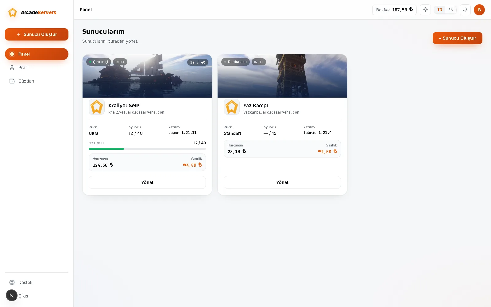
We released a redesigned version of both the ArcadeServers web panel and the marketing site. The goal was simple: put the tool forward and the decoration back.
What changed?
- Neutral, modern theme: Clean surfaces in both light and dark mode. The brand colour no longer covers everything and is used only as an accent where it matters. For anyone staring at the panel for a while, that's a real difference in eye strain.
- More readable pages: Package comparison, features and pricing pages were reorganised so you find what you're after faster.
- Real panel visuals: Marketing images now come from the actual, current web panel rather than mock-ups. You see exactly what you'll get before buying.
- Mobile layout: Tables and cards that overflowed on narrow screens were fixed; managing your server from a phone is now as comfortable as on desktop.
What didn't change?
Your existing servers, settings, worlds and wallet balance were completely untouched. This is an interface refresh; nothing changed in the infrastructure, the billing or how servers behave.
The paths you're used to are still where they were: the names and order of the side-menu sections were kept, only their appearance was simplified.
Why this direction?
A server panel is a tool you open and close several times a day, not a shop window. Dense colour and effects look striking at first glance, but they get tiring by the hundredth visit to the same screen.
So we kept the theme neutral and reserved emphasis for decision points: start/stop controls, warnings and cost information. Everything else stays in the background.
Your feedback matters to us — if there's something you like or find missing, write to us through support.